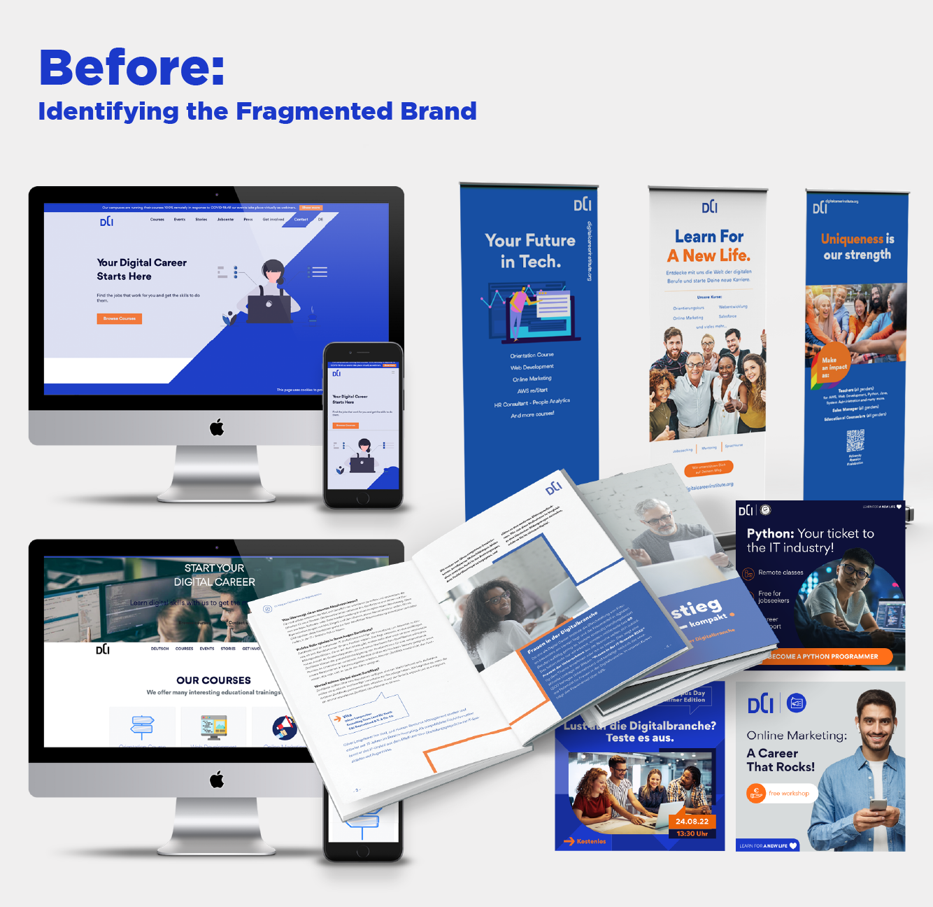
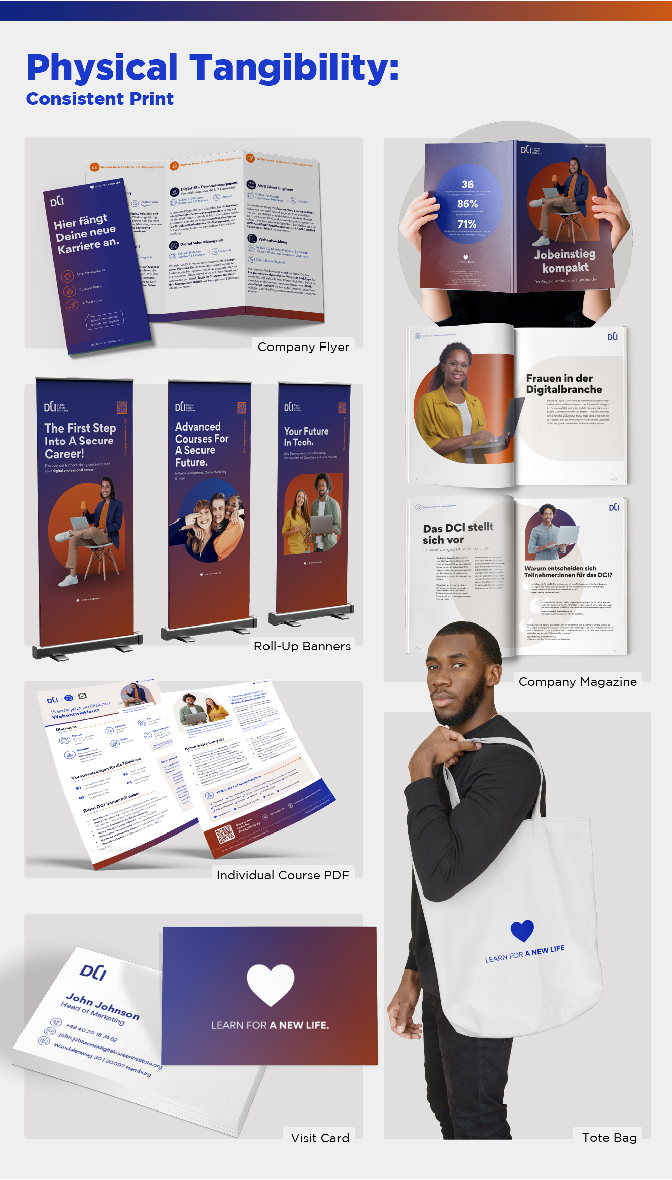
The Challenge: The Digital Career Institute (DCI) faced a fractured brand identity. The lack of a unified design system resulted in a “disconnected” presence: digital assets and print materials (brochures, roll-ups) looked like they belonged to different worlds. The core “Electric Blue” brand color was failing in print, appearing dull and inconsistent, while a symbol-only logo limited brand recognition.
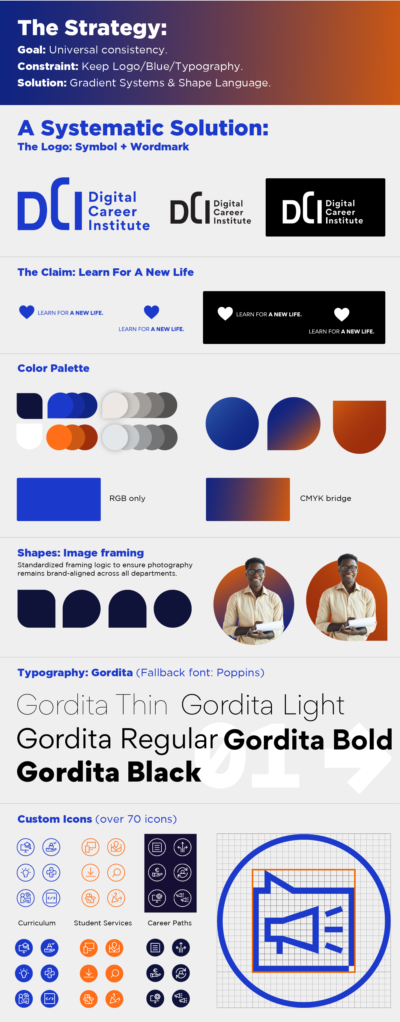
The Strategy: I audited the existing fragments and engineered a cohesive visual ecosystem. I solved the print-reproduction issue by developing a strategic gradient system that bridged the gap between RGB and CMYK. To fix the “incoherent” layouts, I introduced a “Shape-Logic” framing system and a custom icon grid, ensuring that any future asset—from a mobile landing page to a physical tote bag—remains unmistakably DCI.
Key Outcomes:
- Visual Sovereignty: Unified a fractured identity into a single, scalable design system across all digital and physical touchpoints.
- Technical Engineering: Developed a CMYK-ready gradient system to solve “Electric Blue” print dullness, ensuring color parity between screen and paper.
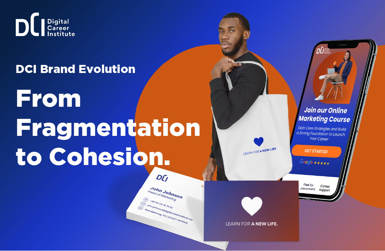
- Brand Authority: Evolved the symbol-only mark into a full logo lockup and integrated the mission-driven claim: “Learn for a new life.”
- Asset Scalability: Delivered a library of custom icon grids and UI templates to streamline future content creation and reduce turnaround time.
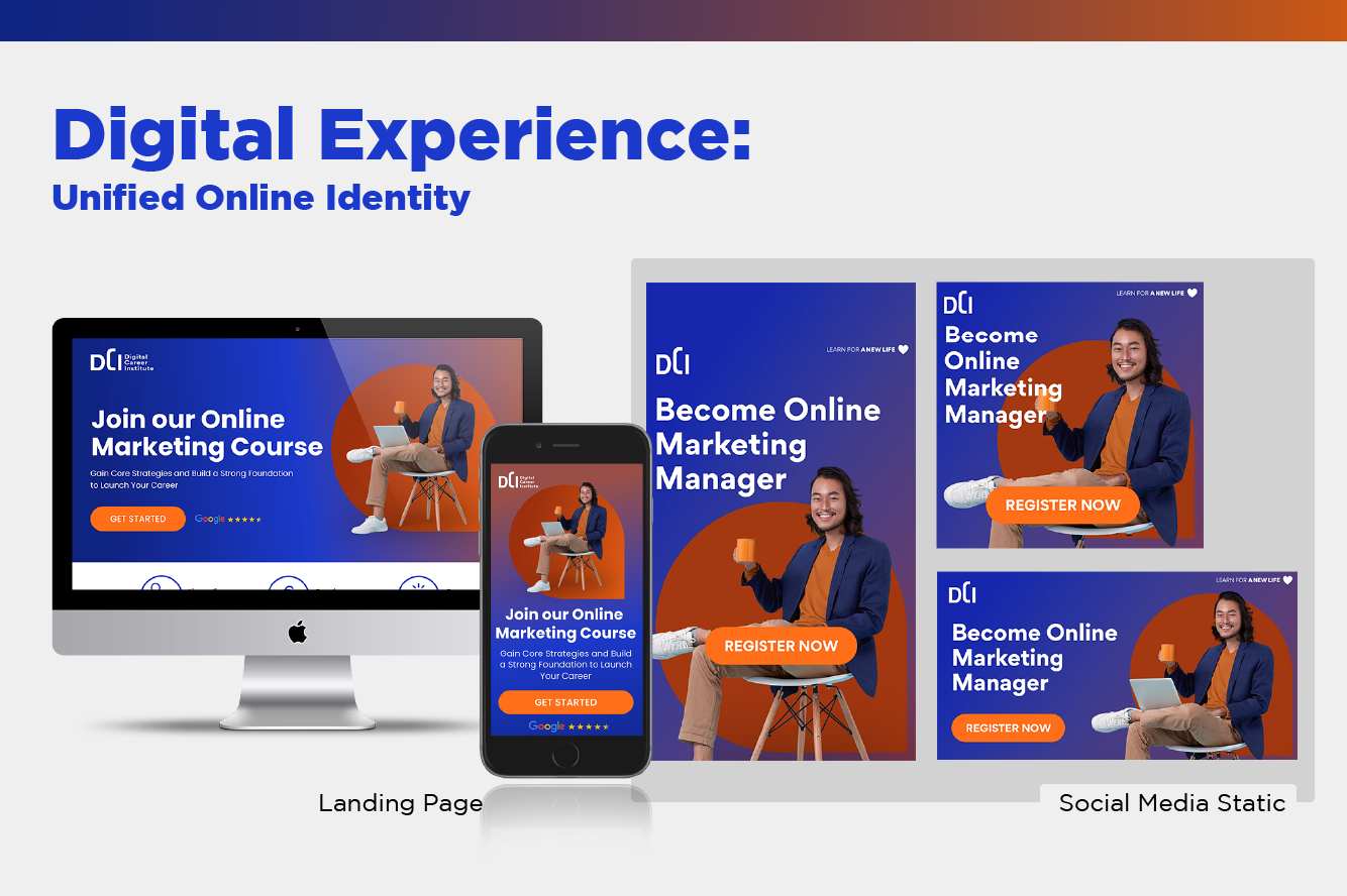
- Omnichannel Execution: Full-spectrum delivery including responsive UI/UX (Figma), motion social ads (After Effects), and large-format print.
Role: Senior Visual Designer (Brand Identity & Systems)
Tools: Figma, Adobe Illustrator, In Design, Photoshop, After Effects